Tuesday, 12 October 2010

Art Nouveau work featuring Aubrey Beardsley, Gustav Klimt, William Morris, William de Morgan, Louis Comfort Tiffany, Charles Rennie Mackintosh, Henry van de Velde and Wassily Kandisnsky.

Art Nouveau and Advertisement:
This is a poster for the first Phalanx Exhibition by the artist Wassily Kandinsky. The work was created in 1901. The poster features charging soldiers in battle pointing their sheilds and spears as they race towards the enemy.

y in this German poster.
Art Nouveau: Aubrey Beardsley
(1872 -1898) was an illustrator and an author. I think Beardsley's work shows a clear link between good and evil, myth fairytale, and class. As well as being influenced by the art nouveau movement he was also a leading figure in the Aesthetic movement – in which the well known play write Oscar Wilde.rite Oscar Wilde was also involved.
Other example of Beardsley's work:


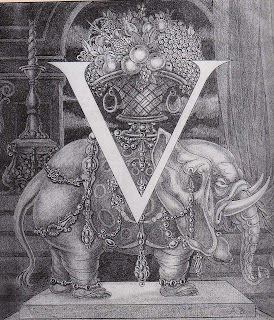
Typography - Art Nouveau the letter V designed by Aubery Beardsley.
Art Nouveau - how an interior of a place may look.
Alphonse Mucha's famous Art Nouveau poster "Zodiac," also known as "La Plume. It was designed in 1896 as a calendar printed by F. Champenois, Paris. Shortly thereafter, the popular French Magazine "La Plume" purchased the rights to Mucha's illustration. The image was widely popular, and it became closely associated with the Magazine. 


William De Morgan November (1839 -1917) A tile designer and potter – was associated with William Morris another artist involved in the Art Nouveau movement. In 1872 he founded his own pottery and showroom in Chelsea, London.
 

Louis Comfort Tiffany  (1848-1933) was an American artist who worked in the decorative arts and is best known for his work in glass design. 
Gustav Klimt:

(1862 – 1914) is a well known artist, one of his paintings was recently sold for $135 million in 2006. His work is defined by swirls and interesting shapes and the colour gold. 

William Morris (1834 – 1896) was a craftsman, poet and socialist educated at Oxford. In 1861 William Morris opened the company Morris and Company which produced wallpaper, stained glass, tapestries, textiles and furniture.

Walter Crane (1845 – 1915) was an artist and illustrator. His work featured some of the more colorful and detailed beginnings of the child-in-the-garden motifs that would characterize many nursery rhymes and children's stories for decades to come.


This poster was designed by the French Artist Pierre Bonnard. The poster uses fashionable art nouveau curves to create a light-hearted image of a woman holding a glass of frothy champagne.

This is a poster designed by Henry van de Velde in 1899.
Tropon “the most concentrated nourishment”  is advertised with curving plant forms that represent only the most abstract idea of nourishment and growth. The lettering of the poster is fully incorporated into the linear design.This is a poster designed by Henry van de Velde in 1899.
Tropon “the most concentrated nourishment”  is advertised with curving plant forms that represent only the most abstract idea of nourishment and growth. The lettering of the poster is fully incorporated into the linear design.

Below: Art Nouveau "Harvest moon" By Charles Rennie Mackintosh.

Thursday, 7 October 2010

my website

http://www.wix.com/netportfolio/homepage

I started working on this before starting university, basically it's a work in progress and as my portfolio gets bigger i'll keep adding to it.

Useful links

www.welcometohr.com

This Website is really useful I found some great things for the lines and points work on here. This website is like a blog it includes many artists work information about the work and the resources the original page came from.

I particularly like this website which was featured in the above link:

www.thequietrevolution.co.uk

My tastes: favourite advert

Mhttp://www.youtube.com/watch?v=MJ7zFAb1KbU

Here is a link to the well known advert advertising Cravendale milk. The message of the advert is that this milk stays fresher for longer. Milk isn't widely advertised and the only other television ad I can think of  relating to milk is about getting people to switch to organic milk.

I think television advertising for milk is very limited because although people have changed the way they consume milk for example we no longer get milk from our local milkman; people are so used to what they usually buy, even if people's lives are generally becoming busier, and Cravendale have a market for their long life milk (as it's more convinient), I'm not sure if the advert is convincing enough to get people to switch to this product.

The advert uses humour to attract the audience, the message is clear and simple and the funniness of the advert is what I particularly like about it.

My tastes: favourite image


This image is unusual and makes me smile, it was taken by the famous photographer Wiliam Wegner. The first thing I notice about the above image is that the dog is wearing walking shoes, which is quite a bizarre thing in itself but the shoes are on backwards! I find it interesting that the dog pictured is a greyhound (a running dog) and the dog is in walking shoes, it reminds me of a play on the phrase "I wouldn't like to be in your shoes." The image shows tension - the stance of the dog and the expression on it's face shows that it is clearly unhappy and uncomfortable with the situation. The dog appears to be looking back at the owner as if to say "What an earth have you done to me?!" The image creates a sense of helplessness as the dog is suck and can't go anywhere.

Being an animal lover I can't help but find this image cute.

I really like that this picture isn't in colour. The focus point of the image- the shoes wouldn't stand out so much,the colour would act as a distraction and the mood of the image wouldn't come across as dramatic.