Links on which I found great book cover designs:
smashing magazine - excellent book covers
book cover archive
Friday, 26 November 2010
Assignment 2: Water for elephants - a book by Sara Gruen
The book water for elephants was set in the great depression. I thought a great way to start my research would be to look at the styles of artwork that were around in this era.
http://www.english.illinois.edu/maps/depression/artgallery.htm
I found the above website very useful as it contains many different images from the era. I particularly liked the works of Edward Hopper and Reginald Marsh. From this website I done further google image searches into these artists, and some other artists found on the above link.


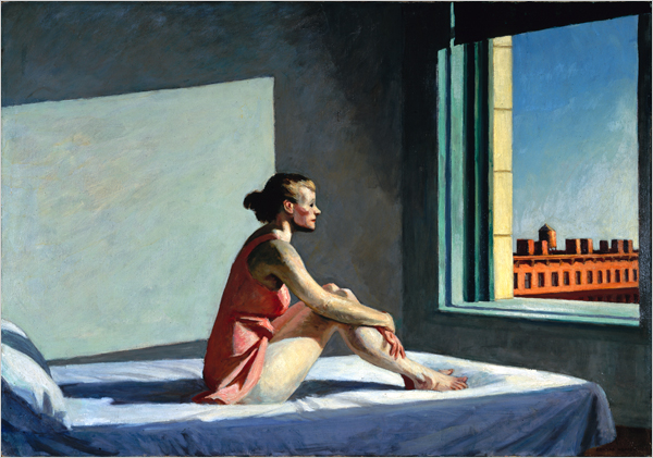


I like how all of Edwards Hopper's characters seem to be deep in thought, and have a back story. And in all the images above although bright colours are used, they contain black and look drab.
I was thinking I could include the main character in the story (Jacob an old man aged 90) on my front cover, the book is all about the old man reminising, and flips between the past and present where he waits for his family to take him to the circus. And for the clothing of the character and room he is sitting him could contain elements from the images above.
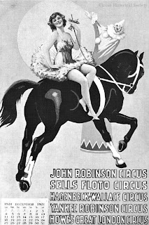
Another part of the story is the circus life - I would definitely like to suggest the idea of a circus on the front cover on my book as it's such a major part of the storyline.
On google I managed to find some images of old circus banners and carriages:


The above posters could come in useful when looking at typography for my book cover. I could trace some letters in Illustrator.
The posters also contain show names/acts I could put on posters on the book cover. These images could be useful ideas for colour scheme and composition. I could try drawing some elements from these images, and others I have found and included in my sketchbook to see if they would work on my book cover.
I could relate these to an old man character reminising about the circus life.
Wednesday, 10 November 2010
Assignment one: my finished images. Main inspirations: Ingrid Baars, James Dawe and Sarah Howell

Blue sky thinking:
The phrase Blue Sky Thinking is all about being open minded and letting your thoughts stretch as wide and as clear as the blue sky.
In this image the birds to me represent the persons thoughts, and the bird cage is a symbol of the minds structure, the cage is open and the birds have been relased. The thoughts escaping represent being open minded.
I experimented with the swirls using a variety of mix media from cotton wool to paint, and filters on the programme Adobe Photoshop. I organised the composition of this piece in the programme Adobe Indesign.
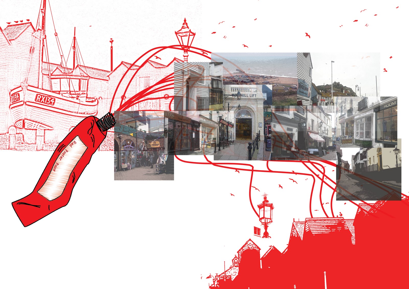
This image is for the phrase paint the town red. This phrase suggests going out and having fun.
This image sums up my home town Hastings, I like the pictuesque old town and thought it would work really well with the phrase. I overlapped the images and experimented with transparency in a David Hockney style.
I also experimented with photoshop filters, using poster edges in many of the images to give an old fashioned painted feel.
The paint tube was drawn up in Adobe Illustrator and the paint tube adds the fun element to the image.

This Image was created for the phrase Red Letter Day
The composition for the final imgage was arranged in the programme Adobe Illustrator.
The image shows the envelope taking an journey to the door, the envelope represents a present and the idea of celebration. The lines in the image are supposed to be fun and string like - i.e party streamers. The stars in the image are a symbol of celebration and luck.
In china on "red letter day" people give each other red letters with money in and this is a symbol of luck and prosperity.
In the ivy leaves on the door are leaves of clover to relate the image to luck.

Monday, 1 November 2010
assignment 1: image inspiration


Above Images from the illustrator Sarah Howell, I like the way all the images flow using swirls images etc.


Above two images by the illustrator James Dawe i like the use of colour and how they contrast with the use of grey.


Above images by illustrator Ingrid baars, i like the way the photographer has experimented with colour, photoshop and transparency


Images from the famous photographer David Hockney I like the clever use of image overlapping and transparency.
Subscribe to:
Comments (Atom)